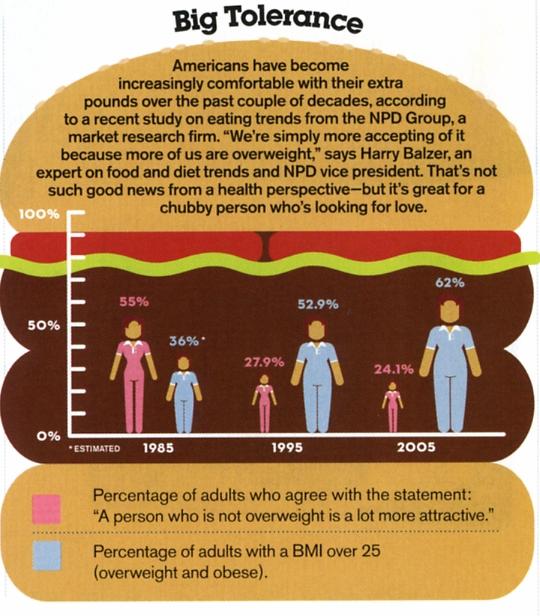
This is a classic example of a graphical deception discussed in Darrell Huff’s How to Lie With Statistics (an assigned reading for the course). The trick is to use only one dimension of a two-dimensional pictogram to illustrate a change in something. Looking only at the numbers, the percentage of adults with a BMI over 25 has risen from 36% to 62%; that is, the number of overweight people (relative to the population) has risen by a ratio of 1.7 to one. But looking at the size of the blue bodies, it appears that the number of overweight adults (relative to the population) has increased by a ratio of almost three to one. Seriously: that blue woman on the right is friggin’ huge! The illusion occurs because when a figure’s size is increased proportionally, the total area of the figure increases with the square of the figure’s height.
Similarly, the percentage of people who agree with the statement “A person who is not overweight is a lot more attractive” has decreased from 55% to 24%; that is, the number of people with this opinion (relative to the population) is less than half what it used to be. But looking at the size of the pink bodies, it appears that number of adults with this opinion (relative to the population) has diminished to less than one-fifth what it used to be.
(Not to mention that BMI is a flawed measured of overweightness for some people. But that’s another matter.)

No comments:
Post a Comment