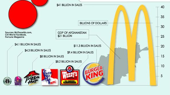
 The graph is intended to show the dominance of McDonald’s over other franchises. But it commits the classic error (seen also in this previous post) of showing differences using a single dimension of two-dimensional pictograms.
Look at the difference between the sales of McDonald’s and Burger King. McD’s makes $41.3 billion, BK only $11.3 billion. So McD’s sales are 3.6 times as large as BK’s. But the eye naturally focuses on the total area of the pictogram, which rises with the square of the proportional increase in height. As a result, the golden arches are nearly thirteen times (3.6 squared) the size of the BK logo. Unless your brain subtracts out the negative space inside the arches, in which case the deception is not quite so bad.
For a clearer example, unaffected by negative space, compare BK and Starbucks. BK’s sales are almost three times those of Starbucks. But if you calculate the areas of the circular logos, you’ll find that BK’s logo is between seven and eight times as large.
Is it possible to be even more misleading? Sadly, yes. Here’s a graph taken from the lower left-hand corner of the map:
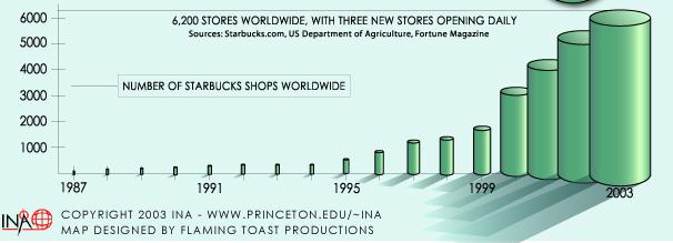 This graph is supposed to show the growth in the number of Starbucks stores over time. But here, the numbers are depicted with three-dimensional pictograms. The apparent volume of the pictograms rises with the cube of the proportional increase in height. Looking at the tops of the cylinders, we can see there were about 2000 stores in 1999, as compared to 6200 in 2003. So the number of stores has approximately tripled. But the volume of the 2003 cylinder is approximately twenty-seven times the volume of the 1999 cylinder.
I won’t speculate on whether these deceptions were intentional.
4 comments:
Running out of good blog topics, are we? Why did I stop cleaning my fingernails to read this?
whee!
Please disregard the comment from the person with the dirty fingernails. Me and my entourage greatly appreciate your educational posts. I hate deceptiveness, especially when I'm not quite sure how or if I'm being duped. Graphs showing a relationship between things should be free of such distortions. You should be hired to police such infractions.
There's the Afghanistan comparison as well. It seems like they compare GDP with sales when it's two different things. It wouldn't surprise me if the value added of McDonalds is smaller than the GDP of Afghanistan. Here's a nice paper on sales and GDP comparison.
The De Grauwe paper may force me to revise my definition of a "Mickey Mouse Country" (one with a GDP smaller than the annual turnover of the Disney corporation).
Post a Comment