Wednesday, May 31, 2006

How to Model USN&WR's Law School Rankings

In a just-completed series of posts, I described recent changes to the methodology that U.S. News and World Report uses to rank law schools. You can find links to those posts below. I now take up a related topic: My model of the USN&WR law school rankings. I'll start, here, by describing how I "reverse engineered" the rankings and by offering some observations about the challenges of that task. In future posts, I'll discuss why I tried to model USN&WR's law school rankings and how well I did.

In brief, I modeled the USN&WR rankings by trying to do the same things that USN&WR did to the same data that it used. That verb—"trying"—merits emphasis. With regard both to USN&WR's methodology and data, I cannot be absolutely sure that I've copied the original. With regard to the data, in particular, I've at best only come pretty close. Allow me to explain.

So far as methodology goes, I of course made reference to the explanation that USN&WR publishes on its website. That proved insufficiently detailed for my purposes, however. I gleaned further details from various other sources, most notably from Robert J. Morse and Samuel Flanigan, the Director and Deputy Director of Data Research, respectfully, at U.S. News. Those busy gentlemen proved very patient and helpful. Though there may remain some minor variations between the methodologies we use, I am reasonably confident that USN&WR does not calculate law school scores in a materially different way from my model.

Copying the data USN&WR uses proved more difficult. I sometimes had the same data that USN&WR did use, sometimes had the data that USN&WR should have used, and sometimes had to guess what data it might have used. Insofar as possible, I used the same data that USN&WR publishes along with its ranking of law schools. In many categories, however, USN&WR does not disclose what law schools told it. In those cases, I made reference to the ABA data that law schools were supposed to have copied onto their USN&WR questionnaires. Only with regard to one datum—the cost of living index that USN&WR applies to each school's reported total expenditures on instruction and administration, one of the components of the Overhead/Student indicator—did I have to generate my own numbers.

The following table offers some details about the methodology used by, and the sources of the data used in, the USN&WR rankings and my model thereof:

DataWeight
in
Ranking
USN&WR's
Source
Published
by
USN&WR?
Model's Source
Peer Rep 25.00% USN&WR survey yes USN&WR rankings
Bar Rep 15.00% USN&WR survey yes USN&WR rankings
Emp at 9 Mos 14.00% ABA data
schools reported
to USN&WR
yes USN&WR rankings
LSAT Median 12.50%ABA data
schools reported
to USN&WR
no ABA data
GPA Median 10.00% ABA data
schools reported
to USN&WR
no ABA data
Overhead Exp/Stu 9.75%ABA data
schools reported
to USN&WR
no ABA data
CoL Index for
Overhead Exp/Stu
N.A. Bought by USN&WR
from 3rd party
no estimated
Emp at 0 Mos 4.00% Reported by schools
to USN&WR
yes USN&WR rankings
Stu/Fac Ratio 3.00%ABA data
schools reported
to USN&WR
yes USN&WR rankings
Acceptance 2.50%ABA data
schools reported
to USN&WR
yes USN&WR rankings
Bar Pass Rate 2.00% ABA data
schools reported
to USN&WR
yes USN&WR rankings
Fin Aid
Exp/Stu
1.50%ABA data
schools reported
to USN&WR
no ABA data
Library
Resources
.75%ABA data
schools reported
to USN&WR
no ABA data


Although figuring out all the details of the methodology used by USN&WR took some time and effort, it did not prove unnecessarily difficult. I wish I could say the same about figuring out the data used by USN&WR. There, the hurdles proved not only higher, but inexplicably so.

As the above table indicates, my search for the data used in the rankings sometimes called on me to do no more than refer to the figures published by USN&WR. In many cases, however—and for no apparently sound reason—USN&WR declined to disclose the data it used. Why does USN&WR publish schools' 25th and 75 percentile LSAT and GPA scores but not publish the medians it actually uses in calculating its rankings? Interested parties could perhaps use the median LSATs and GPAs published by the Law School Admissions Council, but that data is hardly easy to download. More crucially, why doesn't USN&WR publish the data about expenditures and financial aid that schools report to it and the ABA? That data, worth over 10% of each school's score, appears in no public source. As I'll discuss in more detail later, USN&WR could greatly improve its rankings simply by letting all of us know more about the data that it uses. In other words, every entry in the above table's "Published by USN&WR?" should read, "yes."

Earlier posts about the 2007 USN&WR law school rankings:

Read More...

Monday, May 29, 2006

Gains and Losses Due to USN&WR's Use of Reported Median LSATs and GPAs

U.S. News and World Report changed the way it measures LSATs and GPAs in its most recent ranking of law schools. I explained how and why in an earlier post. I here try to describe which schools won and lost the most as a result.

I say, "try to describe," because I face a bit of a quandary. I am not at liberty to disclose the median LSATs and GPAs that schools reported to the American Bar Association, which the ABA makes available subject only to certain restrictions. Unhelpfully—and inexplicably—USN&WR does not report the median LSATs and GPAs that schools reported to it. Instead, it reports only their 25th and 75th percentile LSATs and GPAs.

Comparing the ABA, USN&WR, and Law School Admission Council data (made available via the ABA-LSAC Official Guide to ABA-Approved Law Schools), discrepancies soon become apparent. I have not dwelled on these puzzles, since in each case I've simply stuck with the medians that schools reported to the ABA. As a consequence, however, my model evidently assigns a few schools different median LSATs than those used by USN&WR for its rankings. (GPAs didn't seem to suffer the same problems.) I'll illustrate that effect in a later post, when I compare the USN&WR rankings with those generated by my model. For present purposes, I simply want to observe that I've excluded three schools from the following analysis.

Which of the remaining schools had the largest differences between the median LSATs that they reported to the ABA and USN&WR—the numbers actually used in the 2007 rankings—and the median LSATs that USN&WR would have used in the rankings had it stuck to the methodology used the prior year? Southern Methodist University Law School gained the most by dint of that methodological change. CUNY–Queens College Law School lost the most due to it. A similar analysis of the impact wrought by the change to the methodology USN&WR applies to GPAs shows that it most benefited the University of Toledo School of Law and most harmed the University of Louisville (Brandeis) Law School.

That merely describes the differences that USN&WR's change from calculated to reported median LSATs and GPAs worked to the data that goes into the rankings—not how those differences affected the rankings. To get a rough estimate of that effect (the one that, truth be told, most law schools care about more) we might plug the "old-fashioned," calculated median LSAT and GPA numbers of any of the above schools into a model of the USN&WR rankings, generate a new ranking score for that schools, and compare the result with the school's score in the extant rankings. Herewith some select results:


School Change in 2007
Ranking (pts.)
Southern Methodist U. (TX) +.44
CUNY–Queens Coll. - 1.75
U. of Toledo + 2.9
U. of Louisville (Brandeis) -1.57


As with the similar calculations I performed earlier, to illustrate the impact on the rankings of the change in the Stu/Fac methodology, I caution that the above figures reflect mere estimates. Most notably, they rely on the accuracy of my model of the USN&WR rankings. In a forthcoming post, I will describe how I created that model and document its accuracy.

Earlier posts about the 2007 USN&WR law school rankings:

Read More...

Bi-"Semper Fi "

This Memorial Day shout-out goes to Mom and Dad, both of whom served in the U.S. Marines. Neither made a career of it, being content to fulfill their ROTC requirements and re-enter civilian life. Though the military life enforces uniformity, it seems to have had very different effects on my parents.

I'm of course unsure how military service shaped Mom and Dad, not having known them in their pre-parent days. Dad, who doesn't talk about the experience much, apparently looks back on military service as that long, dull stretch when he had to take orders from idiots. The joys of gunpowder offered little novelty to him, alas, as he'd grown up using firearms (ditto, Mom). Dad walked away with some cool gear, at least—I use his old duffel bag to this day.

Mom looks back on her stint in the Marines more fondly, and with greater pride. She entered the Marines a wide-eyed farm girl from Missouri, back in the day when rather few women served. She left them a widely-traveled young woman who had earned salutes from leather-necked grunts. Mom volunteers at the local V.A. hospital, these days, and says she wants to settle in there when and if she grows infirm. From Mom's service I got not hardware, but one of my favorite expressions about the importance of choosing your battles wisely: "I don't want to die on that hill!"

Here's to you, Mom and Dad: Oorah!

Read More...

Sunday, May 28, 2006

Announcement

I have just been granted tenure.

Read More...

Whence Come the Median LSATs and GPAs Used in the Rankings?

I here take up the last of the four changes that U.S. News and World Report made to its law school rankings this past year: moving from calculated median LSATs and GPAs to reported ones. This post offers some instructive background about the wending path that led to the present methodology. Why "instructive"? Because this wee bit of infometric history may teach us a great deal about how to reform the USN&WR rankings. I'll put off until the next post the one thing most readers probably care about: Who won and who lost by dint of the methodological change?

Prior to the fall of 2004, USN&WR asked each law school to calculate and report the median LSAT and GPA of its full-time first-year class. USN&WR did not ask schools to repeat the medians they had reported to the American Bar Association because that data did not exist. Back then, the ABA's annual questionnaire asked schools for only the 25th and 75th percentiles of their incoming students' LSATs and GPAs—not their 50th percentiles (i.e., their medians).

USN&WR changed its methodology in the fall of 2005, when it asked schools to relate what they had told the ABA about their 25th and 75th percentiles. USN&WR then averaged those percentile scores to generate calculated medians to use in its rankings. Why did USN&WR stop asking schools to self-report medians? Because it had, as Robert J. Morse, director of data research for U.S. News, put it, "heard that some schools weren't computing their median accurately."

Few law schools will risk lying to the ABA, which wields the power to strip a school of its precious accreditation. USN&WR wields no similar power, however. As far as I've been able to determine—and to my surprise—USN&WR does not expressly threaten dissembling schools with any sanctions. It does not even appear to ask law schools to promise to tell the truth. Perhaps it charitably (but, alas, counterfactually) assumes the best about those who respond to its law school questionnaires. Or perhaps, already conscious of the ire its rankings cause, USN&WR worries that straightforwardly demanding honesty would come off as too heavy-handed. But I digress, straying to a topic that I'd planned to cover later, under the heading of suggested reforms.

USN&WR's use of calculated median LSATs and GPAs in the "2006" rankings (released in the spring of 2004) stirred up a controversy. Prof. Brian Leiter, long a critic of the rankings, offered both his own take and, by way of a generous quote, that of a dissenting correspondent. I won't dwell on the wisdom of using calculated medians, however, as the topic has become moot. As Leiter later highlighted, USN&WR changed the way it measures LSATs and GPAs yet again, last fall.

For this year's rankings—the "2007" ones—USN&WR went back to reported medians. Why? "We used a calculated median last year because of an absence of verifiable data for the actual median, but the American Bar Association now requires schools to report these data, permitting us to confirm the figures submitted to us," the magazine has explained. As with the FinAid and Fac/Stu indicators I discussed earlier, in other words, USN&WR has once again followed the ABA's lead when it comes to quantifying the performance of accredited law schools.

What result did the new way of measuring LSATs and GPAs have on the most recent (the "2007") rankings? I'll take that up in the next post in my series. In the meantime, I need to finish grading and, since I gather I'm supposed to be enjoying a holiday weekend just now, perhaps even have some fun.

Earlier posts about the 2007 USN&WR law school rankings:
Change to U.S. News Law School Rankings Methodology;
"Financial Aid" Revised in U.S. News Methodology;
How USN&WR Counts Faculty for Rankings.

Read More...

Saturday, May 27, 2006

How USN&WR Counts Faculty for Rankings

I earlier described how, effective in its most recent law school rankings, U.S. News and World Report changed the ways it tracks employment of graduates and expenditures per student. Here, I touch on yet another recent change in USN&WR's methodology—a change in how it counts law school faculty. In brief, the rankings' Student/Faculty Ratio (Stu/Fac) indicator now covers not just the fall semester, but the whole of the academic year. I close by describing who won and who lost by dint of that change.

With the Stu/Fac indicator as with the FinAid indicator discussed earlier, USN&WR follows the lead of the American Bar Association. Prior to the fall of 2005, the ABA's annual statistical probe (ouch!) asked each law school to report the number of faculty teaching only that fall. The ABA then used that figure to calculate each school's student/faculty ratio. Ditto the USN&WR's inquiry and its calculation of the Stu/Fac ratio, which counts for 3% of each law school's score in the rankings.

That all changed last fall. The ABA started asking law schools to report both the number of faculty teaching during the prior spring semester and the number teaching that fall. It then combined those figures to generate a student/faculty ratio reflecting an entire year's worth of instruction. Ditto, again, the USN&WR questionnaire and Stu/Fac indicator.

Which schools won or lost the most thanks to this new way counting faculty? Because Stu/Fac now averages a school's student/faculty ratio from the reporting fall and the prior spring, it smooths out changes. The new methodology thus disadvantaged law schools that radically improved their student/faculty ratios last year. Herewith those six schools, along with the Stu/Fac ratios that they reported in the 2006 rankings, in the 2007 rankings, and the difference between the two:


School 2006
Stu/Fac
2007
Stu/Fac
Change
Texas Wesleyan U. 26.4 17.9 -8.5
St. Thomas U. (FL) 27.3 20.2 -7.1
U. of Tulsa (OK) 22.7 16.3 -6.4
Thomas Jefferson Sch. of L. (CA) 27.6 21.9 -5.7
U. of Mississippi 22.0 16.9 -5.1
U. of South Dakota 21.2 16.1 -5.1


On the other side of the scale, this table shows the six schools that reported the biggest increases in their Stu/Fac ratios from 2006 to 2007, and that therefore most benefited from the change the ABA and USN&WR made to the faculty-counting methodology:


School 2006
Stu/Fac
2007
Stu/Fac
Change
North Carolina Central U. 16.7 18.8 2.1
U. of Idaho 14.7 16.8 2.1
Brooklyn L. Sch. (NY) 17.8 20.5 2.7
U. of Wyoming 14.4 17.2 2.8
Indiana U. Indianapolis 14.2 18.0 3.8
U. of Montana 13.0 18.2 5.2

How much did those schools win or lose in the rankings? We can work up an estimate by halving the amount of change each of the above schools reported in its Stu/Fac ratio in the 2007 rankings (reflecting the likely effect of the change those rankings adopted for counting faculty), adding that number to each school's 2006 Stu/Fac indicator to generate a proxy for what its 2007 Stu/Fac would have been had the methodology not been changed, and plugging that alternative, "old fashioned" Stu/Fac number into my model of the 2007 rankings. Here are some representative results:


School Alt. 2007
Stu/Fac
Change in 2007
Ranking (pts.)
Texas Wesleyan U. 9.4 1.8
St. Thomas U. (FL) 13.1 1.4
U. of Tulsa (OK) 9.9 1.3
U. of Wyoming 20.0 -0.6
Indiana U. Indianapolis 21.8 -0.8
U. of Montana 23.4 -1.0


I emphasize that those represent only rough estimates. Please note, in particular, that they rely on the accuracy of my model of the 2007 USN&WR rankings. I'll describe that model, the way I created it, and how well it reproduces the actual rankings in a subsequent post. Note, too, that regardless of the gains and losses I estimate that the new Stu/Fac methodology caused, they represent mere transition effects. The new way of counting faculty will affect all schools equally in the next USN&WR rankings.

Regardless of who won and lost by dint of the new Stu/Fac methodology, it bestows two happy effects on us all. Firstly, law schools worried about the USN&WR rankings (i.e., all ranked law schools) will stop pushing faculty to go on sabbaticals, accept visitorships, or otherwise take leaves of absence only during the spring semester. Secondly, would-be students will get more accurate information about law schools' student/faculty ratios.

Other posts about the 2007 USN&WR law school rankings:
Change to U.S. News Law School Rankings Methodology;
"Financial Aid" Revised in U.S. News Methodology.

Read More...

Friday, May 26, 2006

This Graph Needs a Polygraph

As I mentioned earlier, I asked the students in my economic statistics course to do presentations on graphs or tables from print media. Here’s another gloriously misleading one, found by Scott G. in the May 2006 issue of WIRED magazine. It’s from an article titled, “The Digital Music Blues.” The graph is supposed to demonstrate that, in spite of the growth in legal music downloads, illegal downloads are still cutting into the record industry’s bottom line.


Notice how only a tiny 1% of iPod capacity is filled with legally purchased iTunes songs! I guess the remaining 99% percent must all be illegal downloads, right? That’s certainly the implication of the accompanying article: “What’s filling all that excess capacity? Well, despite the efforts of the Recording Industry Association of America, nearly a billion songs are traded on P2P networks every month.”

I checked my own iPod, and sure enough, the songs I bought on iTunes account for only about 1.5% of the 20GB memory. What’s filling the rest? Turns out 62% of it is filled by, um, nothing. I just haven’t filled it yet. The other 36% or so is almost entirely filled with music I ripped from my own legally purchased CDs or those of my relatives.

(Did I mention that most of the data for the WIRED article came from music industry sources?)

I showed this graph to one of my colleagues, and he sheepishly confessed that a mere 25% of his university-provided SanDisk USB memory key is filled with work-related documents and data files. I’m mighty suspicious about, you know, how he might be filling the rest of that memory key...

Read More...

"Financial Aid" Revised in U.S. News Methodology

In my prior post, I described one change to this year's U.S. News and World Report law school rankings methodology: 2% got shifted from the Emp0 indicator to the Emp9 one. I here briefly describe another change of note: dropping the "other direct expenditures" addend to the measure of financial aid. I grant that only USN&WR ranking geeks will find this stuff of interest. Hang in there, though; future posts in my series on the 2007 rankings will offer new ammo for status-seekers, hint at scandal, and suggest reforms that might mitigate our obsession with the USN&WR law school rankings. Devoting this much attention to statistical arcana cannot, after all, be healthy.

The USN&WR methodology includes a measure of expenditures/student called "Financial Aid" ("Fin Aid," for short). Despite its name, though, financial aid makes up only one part of that indicator. In last year's law school rankings—the "2006" rankings—Fin Aid included three sub-measures: financial aid, other direct expenditures, and indirect expenditures. This year's rankings included only two: financial aid and indirect expenditures.

Why the change? Because here, as with most other indicators it tracks, the USN&WR relies on the American Bar Association's classification of quantitative data about law schools. This year the ABA stopped collecting data under the heading of "other direct expenditures."

It might help to know a bit more about the ABA's practices. Each fall, the ABA collects financial and other quantitative data from the law schools it accredits. USN&WR asks law schools filling out its questionnaire to copy over much of the same data. Thus, for instance, USN&WR question 93 asks a responding law school to copy over data from ABA Fiscal Form I.I—Financial Aid. So it goes for all of the addends to USN&WR's FinAid indicator.

In the fall of 2006 the ABA stopped asking schools to report data under the heading of "other direct expenditures." I'm not yet sure why; the ABA has not yet responded to my inquiries about its fiscal reporting practices. Regardless, and whether as a matter of policy or preference, USN&WR followed the ABA last fall in disregarding the other direct expenditures of responding law schools. (In point of fact, the USN&WR questionnaire retained a question about other direct expenditures but forced schools to answer "0" to it.)

That is not quite to say that other direct expenditures dropped entirely out of the 2007 rankings. In calculating a school's Fin Aid (as well as the other financial indicator, "Expenditures on Overhead/Student"), USN&WR takes the average of the last two year's figures. In the most recent law school rankings, then, each school's Fin Aid indicator included both (financial aid + other direct expenditures + indirect expenditures)/student from the fall 2004 survey and (financial aid + indirect expenditures)/student from the fall 2005 survey. That Fin Aid measure, once rescaled into a z-score, counted for 1.5% of each law school's overall score in the 2007 USN&WR rankings.

What impact did dropping "other direct expenditures" from Fin Aid have on the law school rankings? In brief, it looks as if it helped those relatively few schools that formerly had reported "other direct expenditures" to the ABA and USN&WR. Why? Because, judging from the ABA data, it looks as if those schools moved the sums they had formerly reported under Fin Aid's "other direct expenditures" to one of the subcategories of data comprising the Overhead indicator. So what? Whereas Fin Aid counts for only 1.5% of each school's score in the USN&WR rankings, Overhead counts for a whopping 9.75%.

What schools benefited most from the change? For various complicated and sticky reasons, I am hard-pressed to say. "Complicated," because I have no direct proof about how whether law schools reclassified other direct expenditures to inflate their Overhead indicators. "Sticky," because I know only what fiscal numbers law schools reported to the ABA—not what they reported to USN&WR. A school might have told the ABA one thing and USN&WR another. More on that latter problem, though, anon.

Another post about the 2007 USN&WR law school rankings: Change to U.S. News Law School Rankings Methodology.

Read More...

Thursday, May 25, 2006

Cowen's Symmetry Thesis: A Partial Foundation

Tyler Cowen proposes a “symmetry thesis” of relationships:

A given person likes (loves) you as much as you like (love) him or her.

...Let me rule out or explain some obvious “counterexamples.” If a guy stalks you, and you can't stand him, the reality is that he is probably more hostile to you than loving. The thesis fits.

Break-ups are tricky and they provide the best counterexamples. But who really left whom is not always obvious; it can take several years to figure out what was going on. Often the leaving party is the one who first develops a narrative of how things might be different; this is distinct from liking or loving the other person less. Other people leave pre-emptively.

Unilateral crushes are possible and indeed common, although with repeated contact they usually collapse into symmetry, one way or the other.
Hmm. This is a thesis in search of a foundation. Tyler has some guesses about the mechanism(s) behind symmetry, but he seems more certain of the equilibrium than the process that leads to it.

I’ll resist the temptation to jump into the old neoclassical-versus-Austrian debate about the relative importance of equilibrium and process analysis. Instead, I’ll offer my own attempt at a model of the phenomenon involved. This is just one of about four models I cooked up while proctoring an exam. It’s one that both supports Tyler’s thesis (some plausible models didn’t) and replicates the salient features of many relationships I’ve observed.

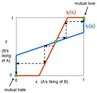
Assumptions: Let xt designate person A’s liking of person B at time t, and yt person B’s liking of person A at time t. Liking ranges from 0 to 1, with 0 = hate and 1 = love. Each person’s liking is a positive function of the other’s liking; that is, the more someone likes you, the more you’re inclined to like them. (Why? I think it’s because we are flattered. Also, if someone likes you, it’s a sign of their good taste!) I’m also omitting a couple of additional assumptions necessary to justify the functional forms in the diagram below.

The green spots in the diagram are equilibrium points. There are two stable equilibria in this situation: (1, 1), meaning that both people love each other, and (0, 0), meaning both hate each other. The middle point is also an equilibrium, but it is unstable. If either person’s liking of the other changes the slightest bit, it sets in motion a chain reaction that will lead to one of the two stable equilibria. Why? That’s where the process analysis comes in. If one person A starts to like B a little more, it initiates a virtuous process: B responds by liking A more, causing A to like B a little more, causing B to like A a little more, until true love is achieved. On the other hand, if A starts to like B a little less, it triggers a vicious process: B responds by liking A less, causing A to like B a little less, causing B to like A a little less, until they arrive in a state of mutual hatred.

It might appear that all three equilibria fit with Tyler’s symmetry thesis. But slight changes in the functional forms (longer or shorter flat pieces, slight curvature in the functions) could result in the middle equilibrium lying off the 45-degree line. Nevertheless, Tyler’s thesis is vindicated by that equilibrium’s instability. We don’t expect the relationship to remain in that state for long, and eventually the parties will fall into mutual love or hate.

There is no middle ground
Or that’s how it seems
For us to walk or to take
Instead we tumble down
Either side, left or right
To love, or to hate.

- Peter Murphy, A Strange Kind of Love

Read More...

Slaving Grace

Brian Moore scoffs at the increasingly common trope of characterizing the employment of illegal immigrants as “modern-day slavery.”

It’s an odd sort of slavery that the slaves run to instead of from.

Read More...

Change to U.S. News Law School Rankings Methodology

[NB: Thanks to an email from Paul L. Caron, of the TaxProf Blog, I here offer a corrected version of my earlier post on this topic.]

As I said yesterday, I plan a series of posts about what I've recently learned about the U.S. News and World Report's law school rankings. Let me start here with a change that I've not seen reported elsewhere: This year's rankings saw a notable change in how the employment of a school's graduates affects its overall score.

In calculating its law school rankings, U.S. News and World Report takes two measures of a school's success at finding employment for its students: the percentage of graduates employed nine months (call it "Emp9") after graduation and the percentage employed at graduation ("Emp0"). Until the most recently-released rankings—the "2007" rankings—the Emp9 measure has counted for 12% of a school's overall score, while Emp0 has counted for 6%. Starting this year, however, Emp9 counts for 14% and Emp0 for 4%. In other words, U.S. News moved 2% from the Emp0 to Emp9. (For more details about the methodology of the rankings, see here.)

Did the new way of measuring law schools' placement efforts affect the rankings? For some schools, almost certainly. Some schools did considerably better on the Emp9 measure, relative to their peers, than they did in the Emp0 measure. Here are the schools that most benefited this past year from the change: Albany Law School-Union U. (NY) and U. of Memphis (Humphreys). Each of those schools gained .03 points in the ranking's 100 scale. Conversely, California Western School of Law and Texas Southern U. (Marshall) were most hurt, each losing .05 points.

Of course, those calculations tell us only about the effect of the change on schools' actual scores—not the rounded scores that U.S. News reports and uses in ranking schools. The change in how a school's placement efforts affects its rankings thus proved most telling to schools that had actual scores near the margin of the next highest or lowest rounded integer score. Since U.S. News doesn't report the actual scores, we can only guess which schools moved in the rankings due the new methodology.

Read More...

Wednesday, May 24, 2006

One Upcoming Change to U.S. News & World Report's Law School Rankings

[NB: Paul L. Caron of the TaxProf Blog emailed me with a kind but crucial correction to my post under this heading: The change I described took place effective for the 2007 rankings. I've thus reposted the material in edited form here.]

Read More...

Tuesday, May 23, 2006

My 7-Year-Old Nephew Understands the Law of Demand

My brother Neal just called to say my nephew Doug had a bedtime question. Doug got on the phone and asked, "Is it better for a store to charge low prices and get a lot of customers, or charge high prices and get a small number of customers?"

Now that's a heck of a good question for a kid his age. Actually, it's a good question for an adult, but what really impressed me was the clear understanding of the Law of Demand implicit in the question. I told him the store should pick a point in between, because either extreme (high price and low sales, or low price and high sales) would be a mistake. I was tempted to jump into an explanation of elasticity of demand and marginal pricing... but I thought that might be a bit much for bedtime.

Read More...

Observations from Beyond the Blogosphere

I've not posted here since May 8. I've hardly looked at a blog, since. What did I learn during my vacation from the blogosphere?

Life goes on, though with much less news from the Respectable Coast. I find myself less well-informed and, consequentially, less irritated with statism. On net, I'd say that I didn't lose much by trading worldliness for contentment.

By dint of many hours cuddled up with Excel, I learned a very great deal about the U.S. News & World Report's 2007 ranking of law schools. This year, as last, I reverse engineered the rankings. I plan a series of posts about my findings, soon. Look for some insights about the most recent rankings, as well as some suggested reforms for future ones.

I didn't just swap words for numbers during my break from blogging. I also swapped talking for doing. I practiced musical composition and performance. Here's one result: An improved version of the Paradise tune, in MP3 or AIFF (iTunes) format, that I mentioned in my last post. I also recorded a tune that I wrote years ago for my daughter, while she remained cosseted mom-side: La Niña (MP3 or AIFF format).

Less intellectually, but very, uh, funly, I also spent part of my break studying shortboarding. That challenge dovetails nicely with the swim clinic I've been taking in recent weeks (my cool b-day gift from the family). Both the clinic and shortboarding have forced me to think—and, crucially, rethink—how I move through water.

I used to swim competitively, back in high school. I wasn't too bad, either; I set a few school records and swam at State. Later, in college, I did a few triathalons. But I never got much coaching on my form, and swimming theory has advanced in recent years. Only now have I begun to catch up.

As for the shortboard, I've long wanted to work my way towards a more maneuverable board. I normally surf a 9'0"—a short longboard, you might say. I like to work it a fair amount, doing cutbacks and floaters. (It isn't much of a nose walker, having no concave section under the tip.) You can only turn so tightly, though, when you have nine foot of board to whip around. So I've added a 6'10" epoxy to my quiver. It falls between a conventional shortboard and a fish in shape, and has a three-fin setup. The board's thickness gives it nice floatability, while the split tail holds well on turns. I've had fun trying to figure it out, though not yet any great rides. That will come, I'm sure, with practice, practice, practice.

All told, not a bad break. But, now, words call again. And, anyhow, I missed posting. I always feel a little happier after I blog. Call me a ham.

Read More...

Monday, May 22, 2006

Territorial Teaser: Too Many Answers

So my most recent puzzle attempt was pretty much a flop, unless there are lots of readers out there still trying to solve it. I started with what I thought (and still think) was a cool solution. But I didn’t spend much time trying to rule out other possible solutions, and it turns out there are an awful lot of them. And even if I’d tried to rule out them all out, I wouldn’t have succeeded without imposing some incredibly arbitrary conditions (like Gil’s suggestion, “The layout must look like my solution”).

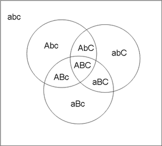
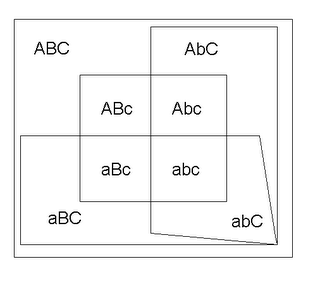
Anyway, here’s the solution I had in mind to start with. I used A/a, B/b, and C/c to refer to the three different demographic distinctions.

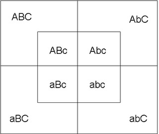
[Shortly after I composed this post, Brian sent me a description of this solution; he was the only person to do so.] But here’s a much simpler solution, a version of which was first submitted by Chris Fulmer:

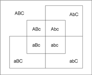
This solution, like many others (including those suggested by Patri Friedman and Chris Hibbert), relies on an up/down, left/right, inside/outside principle for segregating the groups. It doesn’t meet the “landlocking” condition that I added later, but when I added that condition, Chris responded by just taking one of the outside territories and wrapping it around all the others:

And then I began wondering if there was any reasonable set of conditions that would make my solution unique. Blar, who had submitted a solution essentially the same as my own, but using triangles instead of circles...

...suggested adding a condition that no territory touches more than three other territories (not including corner meetings). But the second solution above already satisfies that criterion. The third solution doesn’t satisfy the border-only-three criterion, but it does satisfy landlocking. So maybe we could impose both border-only-three and landlocking? Nope. Blar sent the following variation on the third solution above that meets both additional criteria:

What’s the bottom line? I think Blar gets it right: “All of these solutions are identical in terms of what territories are touching - the only difference besides topologically irrelevant shape-changing is what's touching walls.” And it’s not hard to modify any given layout to meet whatever wall-touching (landlocking) condition you want. I conclude that there’s probably no way to force my solution without a giveaway condition like, “Must use overlapping circles.” Ah, well.

ALSO: The computing background of many readers shone through in their choice to represent demographic categories using binary notation (000 = black male young, 001 = black male old, etc.). But one reader, Ben, used colors instead:

Primary colors (blue, red, yellow) represent pure categories (black, female, old), and absences of those colors represent their opposites. All the other colors are category combinations – e.g., green = yellow + blue = old black male. I don't know if this approach aids understanding, but I like it anyway.

Read More...

Friday, May 19, 2006

Territorial Teaser

I’ve created another puzzle. As before, I don’t yet know if it’s easy or hard. I also don’t know whether I’ve found the only solution or merely one solution. I’m counting on my readers/puzzle-solvers to help answer those questions. As with previous puzzles, I’m asking you not to post your answers in the comments, but to email them to me (at glen.whitman--AT--gmail.com) and tell me about how long it took you to get your answer. I’ll post the solution(s) at a later date. Here goes:

You have a group of eight people. There are two races, black and white; two genders, male and female; and two ages, young and old. All possible combinations are present in the group (so there is a black male young person, a black male old person, a white male young person, etc.). Your task: Divide the floor space of a square room into territories such that the following conditions hold:

1. There are exactly eight territories occupied by one person each.
2. For every demographic group, all territories containing that group’s members are contiguous.* Thus, all territories occupied by blacks are contiguous with each other, all territories occupied by whites are contiguous with each other, all territories occupied by men are contiguous with each other, etc.

* I use ‘contiguous’ in Merriam-Webster’s sense #4, the same sense in which we say all U.S. states but Alaska and Hawaii are contiguous. Two territories touching only at a single point, without achieving contiguity through other territories of the same demographic group, do not count as contiguous.

UPDATE 1: I've gotten two correct answers so far, both different from my intended solution, and with both authors saying it took them only a couple of minutes. The puzzle must be easier than I thought. So I'm adding another condition to harden the target, so to speak. Here it is:

3. At least two of the six demographic groups must be "landlocked," meaning none of the group's territories touches a wall of the room. (And, in case this wasn't clear from the original statement of the problem, the eight territories must completely fill the floor space.)

There. I hope that does it.

UPDATE 2: Still not hard enough? Okay, use this modified version of condition 3:

3a. Three of the six demographic groups must be landlocked.

I've already gotten one solution that satisfies this condition as well. I'm still searching for the set of conditions that makes my solution (or something like it) unique.

UPDATE 3: Answers posted here.

Read More...

Thursday, May 18, 2006

Where Does Speciation End and Bestiality Begin?

According to a recent study reported by The Australian, the evolutionary divergence of humans and chimps may have taken place over a period of 4 million years, during which time the two proto-species interbred on a fairly regular basis. Commenting on the study, anthropologist Daniel Lieberman politely notes the ick-factor involved: "My problem is imagining what it would be like to have a bipedal hominid and a chimpanzee viewing each other as appropriate mates, not to put it too crudely."

But we should set our grossed-outness aside long enough to realize how cool this is. It's easy to think of speciation as having occurred at a moment in time, when the last crucial mutation needed to produce a new species took place. The reality is messier. Delineating one species from another is not easy to begin with, and the features that distinguish them must accumulate over time (as Eugene Volokh once implied, the difficulty of picking a dividing line is what makes the "chicken-or-the-egg" problem so problematic). We shouldn't be surprised, then, to find a transition period in which the genetic changes were great enough to create substantial differences between two kinds of animal, but not great enough to stop them from procreating. According to the article, hybridization is known to be common in plants (whose interbreeding somehow doesn't produce the same "yuck" reaction), but the new study provides the first strong evidence of the same phenomenon in humans. As geneticist David Reich notes, "That such evolutionary events have not been seen more often in animal species may simply be due to the fact that we have not been looking for them."

Read More...

Tuesday, May 16, 2006

How to Fatten Your Figures

In a course I’m teaching on economic statistics, I asked the students to do presentations that critique graphs and tables they found in print media. I didn’t require them to find graphs/tables that were misleading, but it was always gratifying when they did. One student, Jaimie Callanta, discovered the following graph in the May 2006 issue of Women’s Health. The graph shows how Americans have become more tolerant of overweightness at the same time they’ve been getting heavier.


This is a classic example of a graphical deception discussed in Darrell Huff’s How to Lie With Statistics (an assigned reading for the course). The trick is to use only one dimension of a two-dimensional pictogram to illustrate a change in something. Looking only at the numbers, the percentage of adults with a BMI over 25 has risen from 36% to 62%; that is, the number of overweight people (relative to the population) has risen by a ratio of 1.7 to one. But looking at the size of the blue bodies, it appears that the number of overweight adults (relative to the population) has increased by a ratio of almost three to one. Seriously: that blue woman on the right is friggin’ huge! The illusion occurs because when a figure’s size is increased proportionally, the total area of the figure increases with the square of the figure’s height.

Similarly, the percentage of people who agree with the statement “A person who is not overweight is a lot more attractive” has decreased from 55% to 24%; that is, the number of people with this opinion (relative to the population) is less than half what it used to be. But looking at the size of the pink bodies, it appears that number of adults with this opinion (relative to the population) has diminished to less than one-fifth what it used to be.

(Not to mention that BMI is a flawed measured of overweightness for some people. But that’s another matter.)

Read More...

Sunday, May 14, 2006

Affordability of Gasoline

At Commons Blog, guest author Indur Goklany makes a salient point about the affordability of gasoline:

The price of gasoline is on everybody's mind these days, but affordability is just as important. To help put recent gasoline price hikes into perspective, some analysts and media outlets even provide us with information on the real price of gasoline, that is, price adjusted for inflation of the dollar. But even that provides, at best, an incomplete picture. A broader perspective is obtained by looking at trends in price relative to the personal income of the average American, as shown in the following figure.
He then posts a graph showing the history of nominal gas prices (higher than they’ve ever been), inflation-adjusted gas prices (almost as high as they were at their peak in the early '80s), and gas prices as a fraction of income (higher than in the '90s, but still a good bit lower than in the early '80s).

In short, real income has grown faster than the real price of gasoline. Once we take into account the growth of income, gas is substantially more affordable now than during the last big spike in gas prices.

However, Jonathan Adler linked Goklany’s post on the Volokh Conspiracy, and one commenter questioned Goklany’s use of average household income.
One problem with this measure is that the income disparity between rich and poor has increased dramatically since 1978. In my opinion, a more useful comparison would be ratio between price and the income excluding the top quartile.
I’ll go one better, by looking at the price-to-income ratio for each quintile. The graph below shows the fraction of each quintile’s average household income needed to buy 1000 gallons of gas for every year since 1973. (The choice of 1000 gallons was arbitrary, but the same results would hold regardless of how many gallons I chose. [See update below.])


(Sources: U.S. Census Bureau and Energy Information Administration. I only had household income by quintiles through 2004; for 2005 and 2006, I assumed each quintile’s income would grow by the same percentage growth it had averaged over the previous four years. Gas prices for 2006 are based on the first quarter only, and thus don’t include the high prices of the last two months.)

So what can we see? Even looking at the poorest fifth of the population, the fraction of income required to buy gasoline is still lower than it was in the early '80s. Not surprisingly, the fraction has risen a great deal over the last few years, but it still has not surpassed its historical peak. The same holds true for every other income quintile, but the effect is more muted, since higher income means any given price difference will correspond to a smaller fraction of income. (If gas prices stay at their current price of about $2.90/gallon, however, then we could pass that early-80s high-water mark this year.)

How is it possible that the same qualitative pattern holds for both rich and poor, given the rising disparity in income? It’s true that the income gap has increased since the 1970s. But that’s not the same as saying the poor have gotten poorer, because in fact real incomes have risen for every income group over this period. The gap has grown because the rich have gotten a lot richer, while the poor have gotten a little richer.

UPDATE 1: Although I noted that my choice of 1000 gallons per year was arbitrary, I fear that some readers may have gotten the wrong impression. I've noticed some people concluding from the graph that poor people are now spending 22% of their annual income on gasoline! In fact, according to this page, the average American car consumed 550 gallons in 2003. I don't know how that average differs by income class, and obviously some households have multiple cars. My guess is that lower-income households have fewer cars and drive fewer miles on average. But in any case, the point is that 1000 is arbitrary. I could have picked any other number -- say, 100 or 500 -- and the pattern would still have been the same, though the actual numbers on the vertical axis would have differed. (Thanks to reader Patrick Livingood for the link.)

UPDATE 2: And yes, my commenters are correct to note that gas mileage has improved over time, and taking that into account would make gas look more affordable in recent years. On the other hand, people might be commuting longer distances now -- or shorter ones, for all I know. Both mileage and commuting times would be felt as changes in the number of gallons/year, whereas the graph above is based on a constant number of gallons/year.

Read More...

Saturday, May 13, 2006

Posner on Oil Dependence

Richard Posner is right to say high gas prices aren’t necessarily a bad thing. High prices provide a market signal that induces consumers to curb their consumption, producers to expand supplies, and entrepreneurs and engineers to seek out potential oil-substitutes. That said, I couldn’t let this passage go by without comment:

Furthermore, a large part of the world's oil supply comes from nations such as Venezuela, Nigeria, Iraq, Iran, Saudi Arabia, and Russia that are actually or potentially unstable, hostile to the United States, or both, and it would be prudent to reduce our dependence on such suppliers.
Posner here invokes the old shibboleth of dependence on foreign oil. The problem, as I’ve noted before [second post contains a correction to the first], is that there’s more than one kind of dependence. In one sense, we are dependent on foreign oil just because we’re dependent on oil. A reduction in demand for oil would reduce this kind of dependence. But in another sense, we are dependent on foreign oil because, and to the extent that, whatever amount of oil we consume comes disproportionately from other countries. To be more precise, since oil is sold on a world market, the real question is not the origin of the particular barrels we get, but what percentage of the world’s oil supply comes from hostile or unreliable producers. And it turns out that this form of dependence could actually increase as a result of a reduction in demand for oil. Why? Posner gives the reason himself, without seeming to recognize its significance:
Just as an increase in demand will cause higher-cost oil to be produced -- oil that would not have been economical to produce when the market price was lower -- so a reduction in demand will cause that higher-cost oil to be withdrawn from the market and so the average price of oil will fall. In effect, income of the producing nations will be transferred to the consuming nations in the form of gasoline taxes imposed by those nations.
In other words, if the price of oil fell, the highest-cost oil producers would drop out of the market while the lowest-cost oil producers would stay in. And who are the lowest-cost oil producers? Saudi Arabia, Venezuela and Nigeria (when they’re not having riots and strikes), Iran and Iraq (when they’re not having civil wars), etc. The result? Although we would be less dependent on oil, we’d also be more dependent on unstable and/or hostile countries to meet our remaining oil needs.

So which form of dependence matters? I think probably both. Posner’s right to suggest that reduced demand (possibly induced by a gas tax) would cut into the profits of the foreign producers. That’s a good thing if, say, you’re concerned with depriving terrorists of funds. On the other hand, if you’re worried about the vulnerability of our economy to sudden price shocks brought on by civil strife, war, geopolitical tensions, and so on, then you might prefer higher prices as a form of insurance that keeps the higher-cost but more reliable producers in business. Trade-offs are tough like that.

Read More...

Friday, May 12, 2006

Deontology Meets the Mere Addition Paradox

One objection to utilitarianism is its difficulty in dealing with questions of population change. For example, is it desirable to add more people to a population if the new additions have lives that are (a) worth living but (b) not quite as good as the lives of those already living? The larger population would have higher total utility but lower average utility. (Set aside concerns about negative externalities from population growth. Holding the happiness of the already-living sharpens the philosophical question.)

Derek Parfit’s “Mere Addition Paradox” (MAP) shows how both total and average utilitarianism can lead to bizarre and (seemingly) unpalatable conclusions. This article by Kai Chan has the best explanation of the MAP I’ve found, all in the first three pages. Here’s my quickie explanation: Suppose you have an existing population with relatively high utility. Someone proposes an addition like that described above (new people with lives that are worth living but below the previous average). Should we favor the proposal? The obvious answer seems to be “yes,” or at least “there’s no reason not to.” Adopting average rather than total utilitarianism could allow you to resist this conclusion – but that’s precisely what’s bizarre about average utilitarianism. So the new group is added on. Once those people are in existence, someone proposes a slight redistribution of resources that will make the new people better off and the old people worse off, with an overall net positive result (the utility gains exceed the utility losses). This proposal, too, is difficult to resist. But now consider the addition of yet another group of new people, with lives worth living but less satisfying than the lives of those who already exist. Repeat until you have a very large population of people with lives barely worth living. This is what Parfit calls the “repugnant conclusion.”

Now, what I’m wondering is whether an analytically similar problem might afflict some deontologists (e.g., natural rights theorists) who think they’ve managed to dodge the problems of utilitarianism. Say you have a population of people whose rights are respected perfectly. And suppose the population could be increased through the addition of a new group of people whose rights are mostly respected, albeit with the occasional violation. On what grounds could the deontologist resist the addition of this group? These people would, presumably, prefer to live despite the occasional rights violation. And in any case, if the deontologist believes in a right of procreation (or opposes any intervention to stop procreation), then he would have to allow the entrance of the new group.

Next step: Once we have the larger population, suppose we have the opportunity, via some change in policy, to redistribute the rights violations so that the new group has fewer rights violation, the older group has more, and the total number and severity of rights violations has fallen. Now, here the deontologist might object: right violations are not interpersonally comparable. The lesser violation of the rights of some does not compensate for the greater violations of the rights of others. But I don’t think this position will withstand scrutiny. The deontologist would have to resist changes in enforcement policy that would, say, prevent 1000 forcible rapes while allowing one more act of shoplifting. Or, at a minimum, he would have to shrug his shoulders. Similarly, the deontologists would have to resist (or at least be indifferent to) any change in the form of government that would result in lesser protection of any person’s rights. In practice, I don’t believe deontologists actually think that way. (Notice, for example, the many deontologist anarcho-capitalists who favor abolishing the state in favor of private protection agencies, even though such a change would assuredly cause some people’s rights to be better protected while at least a few others’ rights suffered.) So I think that reasonable deontologists would have to accept the proposed redistribution in rights protection.

Now repeat the process. The endpoint will be a society with the maximum number of people that could be sustained at some minimal level of rights protection.

The problem, for both utilitarians and deontologists, results from an intransitivity driven by the distinction between actual and potential persons. For both groups, it seems strange to regard non-existent people as having morally relevant interests (for the utilitarians) or inherent moral rights (for the deontologists). Yet once such people do exist, their interests and/or rights suddenly matter. For utilitarians, that means weighing their interests against those of other real people. For deontologists, it means respecting and protecting their rights. That might seem to require no sacrifice of the rights of others – until we recognize that rights protection is costly, and therefore we can’t avoid trade-offs in rights protection. Within a given regime, the trade-off is felt in the allocation of law enforcement resources. Across regimes, the trade-off is felt in the choice of which regime to favor. To make the problem yet more vexing, the people who exist under each regime will differ (because, at a minimum, sensitive dependence on initial conditions means that different sperm will meet different ova).

For related thoughts about deontology versus consequentialism, see my post on lexicographic orderings.

Read More...

Wednesday, May 10, 2006

My New Favorite Expression

In the latest volume of the Flashman chronicles (not as good as previous installments, but still entertaining enough), a drunken Abyssinian despot utters the phrase, “Man abat?” The accompanying footnote helpfully explains:

Man abat?” lit. “Who’s your father?” seems to have been an Abyssinian catchphrase used as a facetious greeting, not unlike “What’s up?” or “What’s cooking?”
Well, that’s it then. “Who’s your father?” is now my new standard greeting – or at least it will be, once I’ve gotten accustomed to saying it in a casual tone.

On a related note, I’ve wondered occasionally about the English words for children born out of wedlock. ‘Illegitimate’ is deemed the polite, politically correct substitute for the insulting ‘bastard.’ But considering the words’ origins, maybe it should be the other way around. ‘Illegimate,’ from the Latin, means ‘not legal’ or ‘not right’ or ‘not appropriate.’ On the other hand, ‘bastard’ apparently comes from the Old French for ‘packsaddle,’ a reference to travelers’ use of packsaddles as makeshift beds. So ‘illegitimate’ indicates a derogatory judgment, whereas ‘bastard’ merely describes a mode of conception. Doesn't it seem like the more descriptive, less judgmental term would be preferred?

Read More...

Monday, May 08, 2006

Unintended Consequences, Chinese Divorce Edition

In matters of business, economic incentives matter. But in matters of love and marriage, it’s not about the incentives, it’s all about the cultural norms. Right? Well…

Authorities in China, to support the rapid industrialization of Chongqing, are confiscating large tracts of rural land nearby. You think eminent domain abuse is bad in the U.S.? Imagine what it’s like in a country where the government officially owns all the land in the first place. As compensation for the land they’ve lost, the government is offering the displaced villagers apartments in newly constructed housing projects. The result? A massive surge in the divorce rate:

As they [the villagers] understood the compensation deal, each married couple would receive a small two-bedroom apartment in return for their land and farmhouse. Those divorced would get a one-bedroom apartment each. The villagers figured that would be a better deal, that they could live in one apartment and make a little extra income from selling or renting out the extra one.

So, whereas farmers elsewhere took to the streets with their picks and plows demanding higher compensation in protests seen across the Chinese countryside, the folks in Renhe took a gamble with their marriages.

“Divorced? How could I not be divorced? It's now a local custom!” Yan [Shihai] said as he sat on the stoop outside his new apartment building with a handful of neighbors — all divorced, of course. “Even if we hate it, we have to do it. Divorce gives us a chance to sit on a longer bench. Don't get divorced, and you sit on a small stool or in the dirt.”
For the whole sad chain of unintended consequences, read the whole thing.

Read More...

Kai, Musical Genius

A few mornings ago, waiting for Kai to finish his breakfast, I sat down with my acoustic guitar and practiced a few tunes. To my chagrin, Kai stopped eating and started fiddling around with his fingers.

"Why aren't you eating your breakfast?" I asked.

"I'm playing the piano," he explained.

I foresee great musical things from that boy—much as I do his sister, A.J. I don't peg Kai's particular gifts on his still-unproven piano playing, however. Rather, I credit his musical taste. Witness the evidence:

I asked Kai to not forget about his breakfast and went back to playing. I soon started riffing around some new chord progressions, and worked up the core of a twee song. Kai listened patiently. As we later prepared to leave the house, I returned to the tune and sang trial lyrics over and over the same, somewhat oversweet melody.

I love wakin' to another day in paradise.
A swell's comin' in; the weather is nice.
I love welcomin' another day to paradise . . . .


"Stop singing that, Daddy," Kai stated.

"You don't like it?" I asked him.

"No. You sing it too much," he explained.

I meekly stopped, not wanting to bruise Kai's delicate sensibilities. I didn't give up on the tune, though. I worked up some more lyrics. D politely informed me that they doubled up on the entendres a bit heavily, so I toned down the wink-wink stuff. (I think Kai gets his good taste from her.) And I have pretty well ironed out the lead guitar. Check it out in MP3 or AIFF format. I call it "Paradise." It runs only about a minute and a half, so you won't suffer much. Rest assured, I don't sing; it's just a buzzy guitar.

You other critics out there, please take note: Yeah, I know I need a drummer. Think of those pauses as dramatic devices (rather than as mad scrambles for the new fingerings.) And, yeah, it runs a little rough. Cuts the treacle, I figure.

[NB: Since posting the above, I've replaced the recording with a later, arguably better one.]

Read More...

Thursday, May 04, 2006

Gun Control and Crime

The latest edition of the Cato Journal just crossed by desk. Among other interesting papers, it includes John C. Moorhouse & Brent Wanner, Does Gun Control Reduce Crime or Does Crime Increase Gun Control? 26 Cato J. 103 (2006). The authors conclude, at p. 121:


[T]he empirical analysis presented here provides no support for the contention that gun control reduces crime rates. In none of the regressions for the 10 categories of crime rates in 1999 and the 10 for 2001 is the measure of gun control statistically significant. The article tests another hypothesis, namely, that lax gun control laws in neighboring states undermine the effectiveness of state gun laws. It finds no support for this hypothesis. The proxy for neighboring state gun control is never significant in any of the 20 regressions estimated.

By contrast, the article provides empirical support for the idea that high crime rates generate political support for the adoption on more stringent gun controls. Moreover, there is empirical evidence that the probability of adopting more gun regulations is positively related to the proportion of Democrats in the state legislature.


Note that the authors' work neither confirms nor denies Lott's controverted study about the effect of concealed carry laws.

Read More...

Fresh Thinking About Fresh Dinosaurs

Remember the news blurb, some months ago, that paleontologists had discovered soft tissue from a T. Rex? Though intrigued, I could not find more details at the time. Yesterday, though, while waiting to see the dentist, I chanced across an article illuminating the breakthrough. The story—Helen Fields, Dinosaur Shocker, Smithsonian Magazine, May, 2006—also offered a charming portrait of the unusual scientist credited with the discovery, Mary Schweitzer.

Although Schweitzer had been fascinated in dinosaurs as a child, she began pursuing a doctorate in paleontology only long after having graduated from college with a degree in communicative disorders. In the meantime, she had married, had three kids, and taught remedial biology to high schoolers. Perhaps that unusual background helped her to question the assumption that soft tissue could not survive fossilization. As a fellow paleotologist said of Schweiter, "If you point her in a direction and say, 'Don’t go that way,' she’s the kind of person who’ll say, 'Why?'—and she goes and tests it herself.”

Unhappily for Schweitzer, creationists have seized upon her work as an alleged proof that dinosaurs did not live millions of years ago. Although a devout Christian, she also embraces science. Fields says that, for Schweitzer, "science and religion represent two different ways of looking at the world; invoking the hand of God to explain natural phenomena breaks the rules of science. After all, she says, what God asks is faith, not evidence. 'If you have all this evidence and proof positive that God exists, you don’t need faith. I think he kind of designed it so that we’d never be able to prove his existence. And I think that’s really cool.'"

I'm looking forward to offering a copy of the article to my daughter, A.J. She, too, had a childhood passion for dinosaurs, and continues to love science. Among her many other career plans—cartoonist, professional singer, dolphin trainer—A.J. dreams of become the first field marine astrobiologist. It turns out that Schweitzer has dabbled in the search for ancient extraterrestrial life, too. Better than that, though, Schweitzer offers an inspiring example of how a hard-working iconoclast can triumph over conventional thinking and willful ignorance.

Read More...

Wednesday, May 03, 2006

How Not to Legalize Drugs

I want to give a great big cheer for Mexico’s new drug policy. I want to, but I can’t. On its face, the policy seems like a victory for opponents of the drug war, as it eliminates punishment for use and (limited) possession of marijuana, cocaine, heroin, and a variety of other drugs. But I fear that, much as California’s “deregulation” of electricity markets gave real deregulation a bad name, Mexico’s “legalization” of drugs will give real legalization a bad name.

The problem? Mexico’s new policy maintains, even strengthens, the laws against drug trafficking. The Mexican government will go after the producers, transporters, and dealers, and they’ll have even more funds with which to do so. But it’s precisely the anti-trafficking efforts that spawn most of the violence and other adverse consequences of the drug war.

With the elimination of anti-user laws, demand for drugs will increase (on this point I think the drug warriors are correct; the forbidden fruit syndrome is real, but probably not large enough to overcome the penalty effect). The larger demand will create an even greater incentive for suppliers to enter the market and battle it out for market share. Tougher anti-trafficking policy will simply increase the comparative advantage of the most dangerous suppliers. Having a stronger incentive to market their product, but still lacking legal means of enforcing their agreements, they will resort even more often to private – and often violent – means of enforcement. So don't expect violent crime to drop much; it could easily rise. And users, while no longer thrown in jail for their drug use, will still have no recourse against dealers who cheat them or supply them with tainted product. So don’t expect drug overdoses to drop, either.

On the up side, at least Mexico’s policy signals changing attitudes. People have begun to realize the current drug policy just isn’t working, and they are questioning the wisdom of treating a vice as a criminal activity. Yet the new policy simultaneously perpetuates the notion that it’s okay for people to consume something unhealthy but somehow terribly wrong for anyone else to sell it to those who want it. Sadly, if this experiment produces undesirable consequences – as I think it will – then public opinion could turn against true legalization.

Read More...

Tuesday, May 02, 2006

Flowing Contract Damages

I'm pretty happy with the Contract Damages Flowchart that I recently created for my students. That link goes to the full PDF. I here offer a shrunken GIF of the one-page classroom handout:

Contract Damages Flowchart

As the fine print at the flowchart's bottom indicates, it represents only a draft version. I welcome your comments. It might help you to know, in judging the flowchart's efficacy, that I aimed to illustrate three main points:

1) How different rights may lead to similar remedies (see, e.g., how quasi-contract and contract claims may support an award of restitution);

2) How claimants may sometimes elect between different remedies (as when a party suffering breach chooses between expectation, reliance, or restitution damages); and

3) How various rules sometimes limit restitution and reliance damages to the contract price or rate.

The draft raises three questions (and I offer three tentative answers):

1) Does the color help or hurt the pedagogy? (I think it helps)

2) Does the contract price or rate cap restitution claims by a party in breach? (I should think so.)

3) Do the doctrines of avoidability and foreseeability limit non-contractual claims, such as restitution damages under quasi-contract or reliance damages under promissory estoppel? (Tough call. I'd venture that those defenses either don't apply to the fact scenarios implicit in those claims, and that promissory estoppel already somewhat incorporates the foreseeability limit.)

Read More...